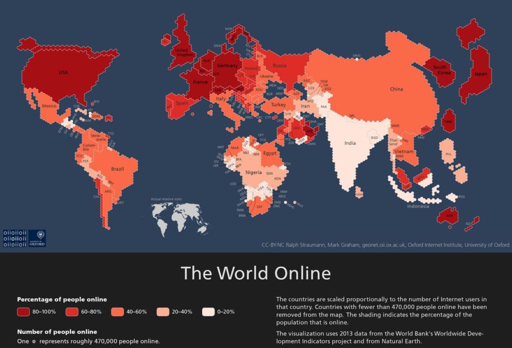
Well, check out this awesome map by The Oxford Internet Institute. It shows the world in an unusual light though, as it depicts each country based on the population of its internet users.
Countries which have more internet users appear larger, while countries which have a higher density of active users are colored darker. Neat. In this world map, Russia and Africa as a whole have shrunk down significantly, while India and China have grown.
Each hexagon on this map represents approximately half a million people, with dark red corresponding to 80% density, and white corresponds to 20%.
A few interesting facts can be gleaned from this map: Asia represents nearly HALF of the total internet users in the world. Europe, America, South Korea and Japan seem to have the highest percentage of active internet users overall. Africa’s internet usage has grown tremendously over the past few years, since the last time Oxford did its study in 2011.
Internet usage has certainly grown among countries that were once considered to be in the developing world, and it is the web-surfing habits of this growing market that will steer the content of the internet in the coming decades. Hopefully this shift will mean far more diverse opinions across the world’s web forums, and more diverse content on platforms like YouTube.


LOLXZ
So, Where is Canada on that map?
Sorry to be the one with the negative response but this map is total hokum. More Chinese people using Internet per capita than what Australians do.
How can I come to this conclusion because the Internet speed 500 times faster than Australia’s.
Because of the socialist regime in China most traffic go through domestic servers rather than international servers. So the distortion of the numbers is dramatic. This can also be the for India but with a different twist. Most Indians used an Internet while they’re at work rather than at home because of poverty.
Also Singapore is characterised as having a lower Internet use in Australia. This is actually a pure fabrication as most Singaporeans owned more computers than the average Australian as well the Internet is about 300 times faster. How can I say this because the greatest amount of gamers Australians link with are from Singapore. There also is more Singaporeans linked to steam than there are Australians in Australia.
Unfortunately there is nothing accurate about this map. It is likely that this data collected to create this map did not take into consideration per capita. You can bank on it.